Aer Lingus Brand Colour Standards
The world of colour reproduction can be surprisingly complex. From RGB and CMYK to Pantone spot colours, achieving consistent brand colours across different print processes, materials and suppliers requires careful management and standards.
I worked with the Aer Lingus Marketing Team to create a detailed guidebook and a set of pocket swatch cards. The objective was to empower marketing team members and other departments to confidently assess colour accuracy when reviewing printed materials and products sourced from a wide range of suppliers.
Both the guidebook and swatch cards were produced by Colorman, using the latest technology by Delta E measurements, ISO colour standards. These tools provide a valuable benchmark for maintaining consistency and protecting the integrity of the Aer Lingus brand across every printed touchpoint.
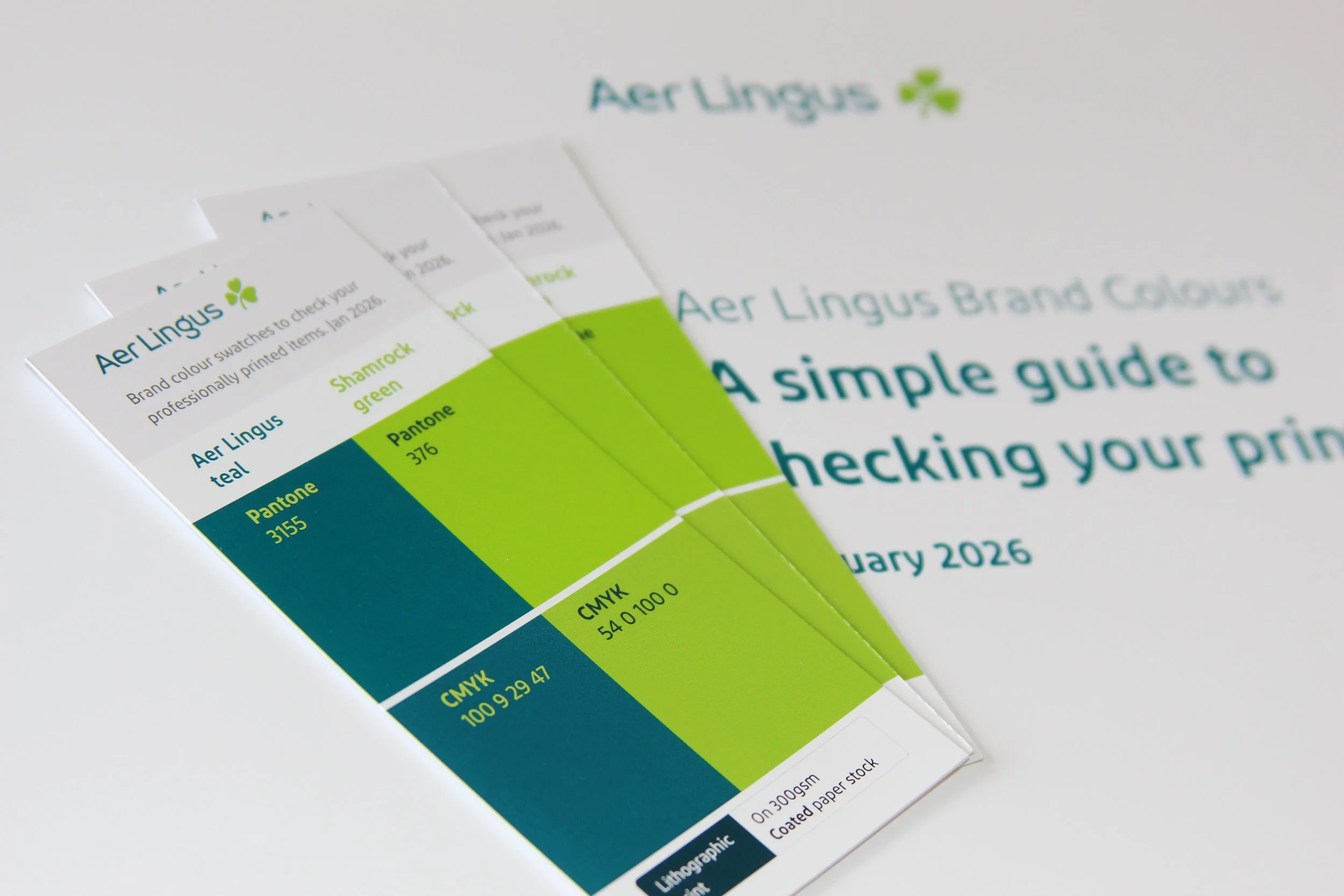
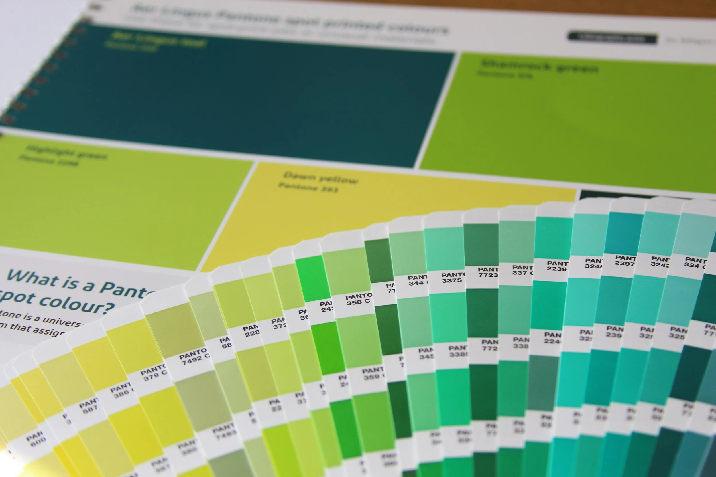
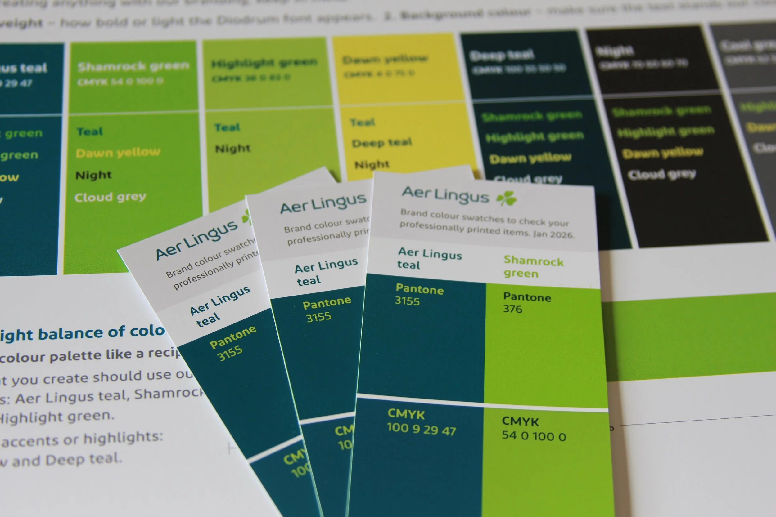
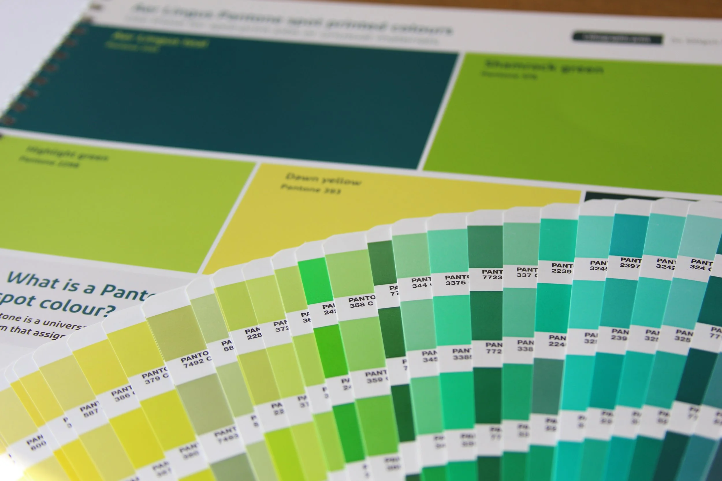
The guide showcases the differences between CMYK process colours and Pantone spot colours, helping users make informed decisions during specification and approval stages. Compact pocket swatch cards were also created, displaying the two primary Aer Lingus brand colours in both CMYK and Pantone formats side by side, for reviewing brand colours on the go.